Overview
Mission
To enhance the student learning experience by redesigning the MyCourses portal to address the current challenges of poor navigation and difficulty in locating necessary information.
Duration
2 Months
My Contributions
Redesigned MyCourses through user research and close collaboration with faculty, resulting in simplified navigation and an enhanced learning experience for students.
Services
Information Architecture
Interaction Design
UX design
Key Results & Impact
Through the redesign of the RIT MyCourses portal, the project targeted measurable improvements in the student experience.
25%
Estimated reduction in time spent navigating course materials.
40%
Improved clarity of weekly schedules.
30%
Potential increase in on-time assignment submissions.
Research
Why Redesign Was Needed
The existing MyCourses platform presented significant usability challenges, as evidenced by user surveys conducted with RIT students, which hindered their success and overall satisfaction.
Quantifiable data
57%
Users struggle with navigation and locating course materials.
29%
Users find it hard to track and manage specific course content
14%
Users feel lost due to unclear structure and lack of visual cues.
Qualitative data
“Better content organization tab, or open a lecture in a new tab always.”

"... to be able to remove/add items in the work-to-do section of MyCourses dashboard."

“Customizable To Do list”

"Most important should be on top like near the deadline, or next class..."

“Make an announcement tab instead of showing it on homepage.”

“Add tasks and notes to our calendar/list.”

Problem Statement

OBJECTIVEs
Centralized Weekly View
To consolidate all essential course information for the week into a single, unified view, eliminating the need for students to navigate between multiple pages or platforms.
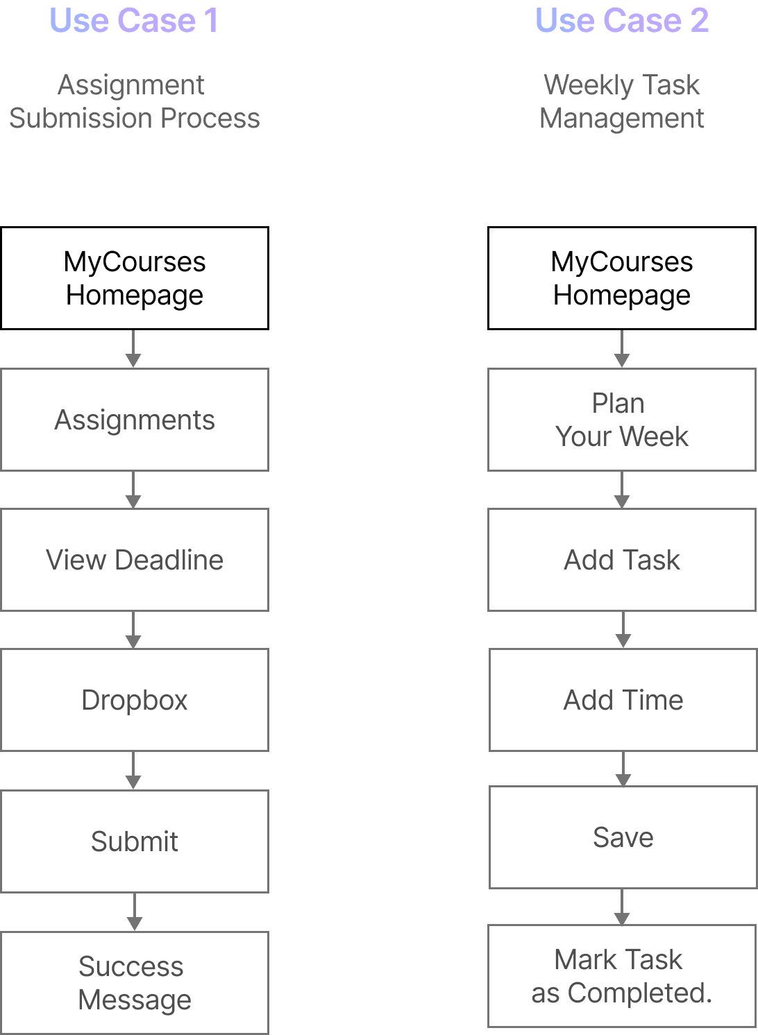
Personalized Weekly Management
To empower students to effectively manage their weekly workload through customizable planning tools, such as a to-do list feature, enabling them to prioritize tasks and track progress.
Streamlined Assignment Submission
To simplify the assignment submission process by enabling students to submit their work directly from the home screen, reducing the number of steps required and improving efficiency.

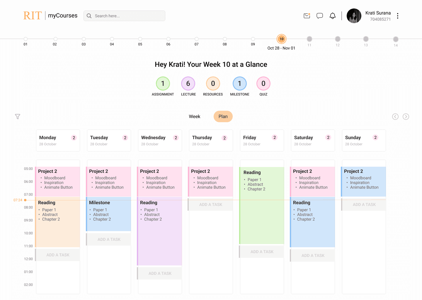
Solution
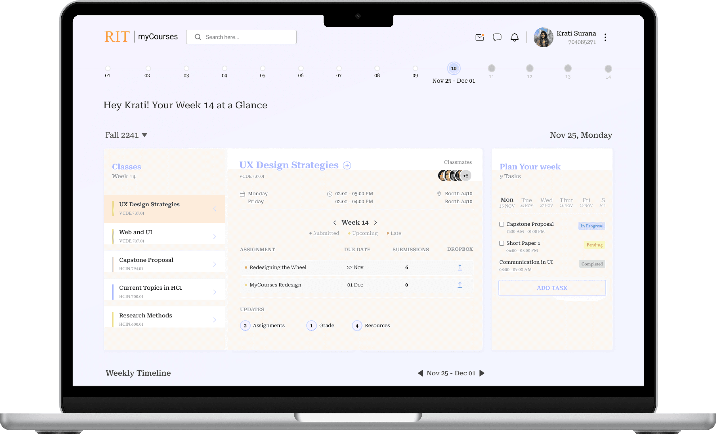
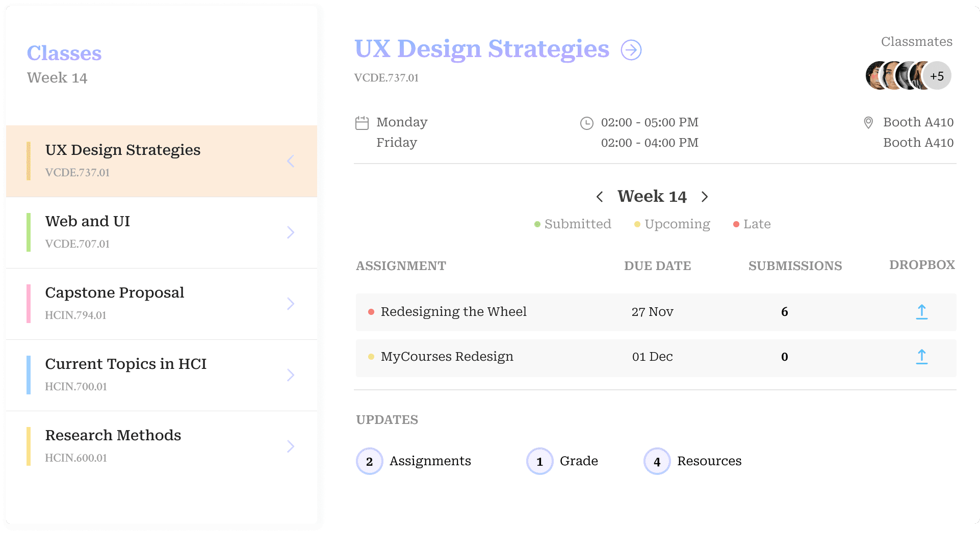
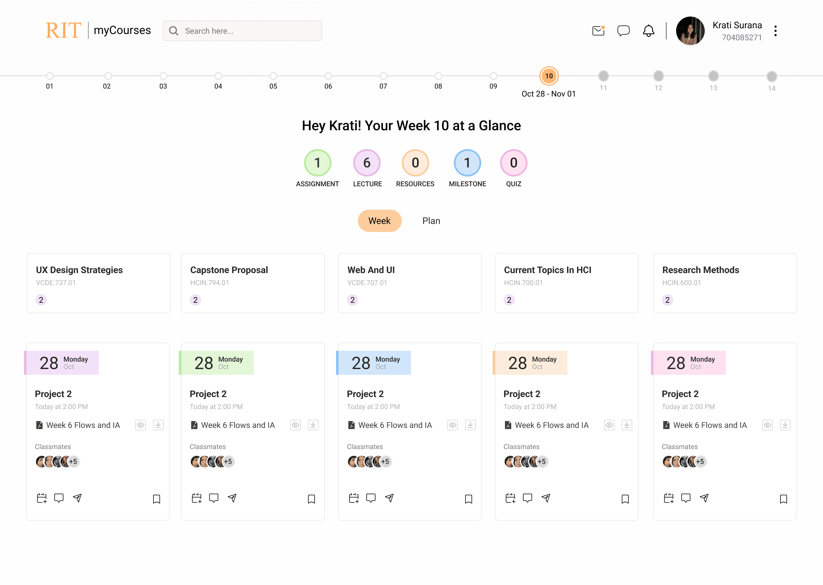
To address the challenge of scattered course information, I designed 'Class Card,' a unified weekly view accessible right from the home page. Previously, students had to navigate multiple pages to gather this information. 'Class Card' streamlines access to all assignments, deadlines, course schedules, and updates, significantly reducing the effort and helping students stay organized.
Class Overview
The left panel lists all classes for the week, color-coded for easy identification. This provides a quick overview of the week's schedule at a glance.
Clicking on a class name expands the view to show more details, such as assignments and deadlines.
Assignment Tracking
This section displays assignments with due dates, submission status, and direct links to the dropbox, providing a quick progress summary and highlighting critical tasks to prevent missed deadlines.
Color-coding indicates the status of each assignment (e.g., upcoming, late, submitted).
Course Updates Section
The Updates panel highlights recent changes to assignments, grades, and resources, keeping students informed without extra navigation.
1
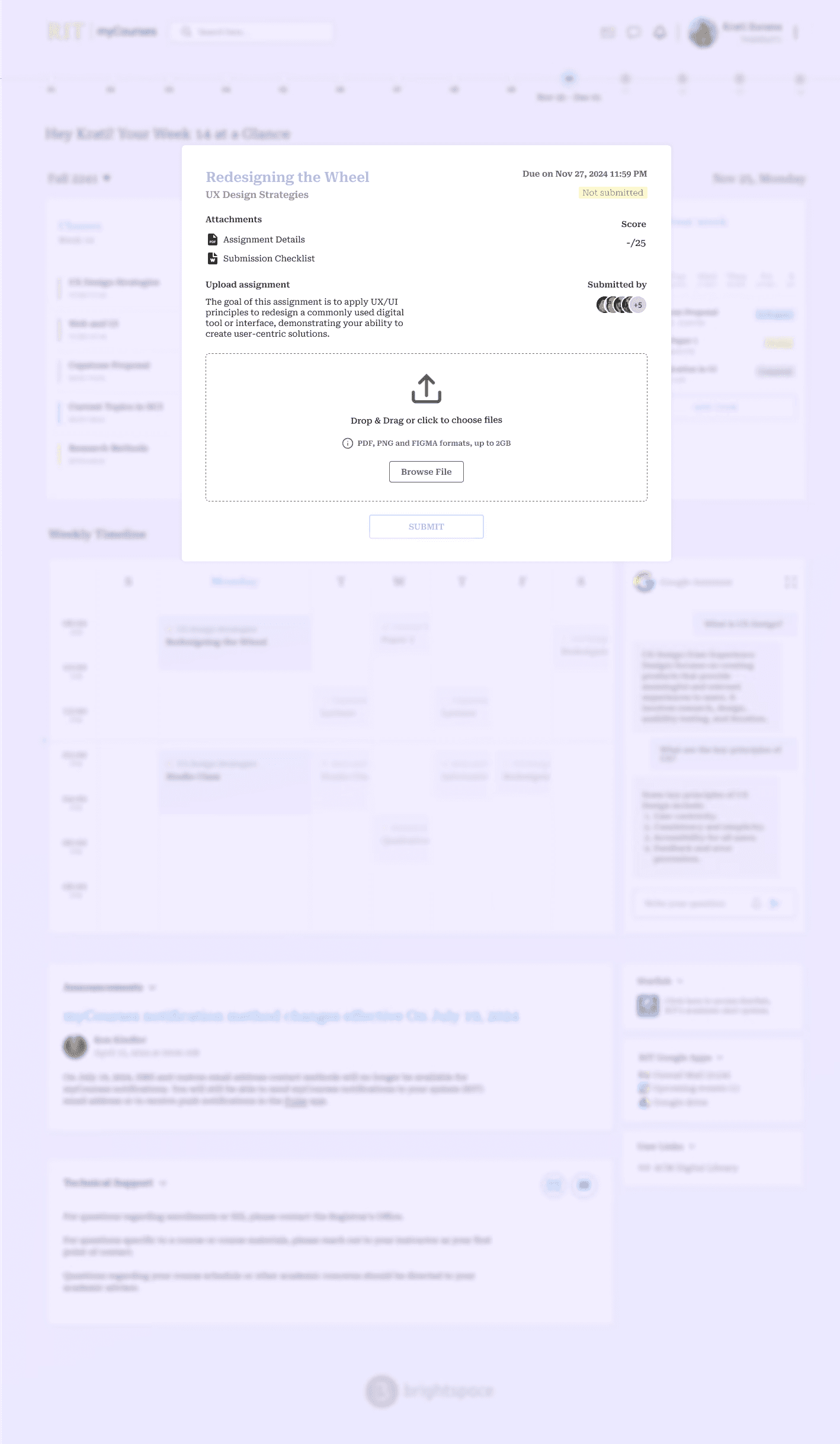
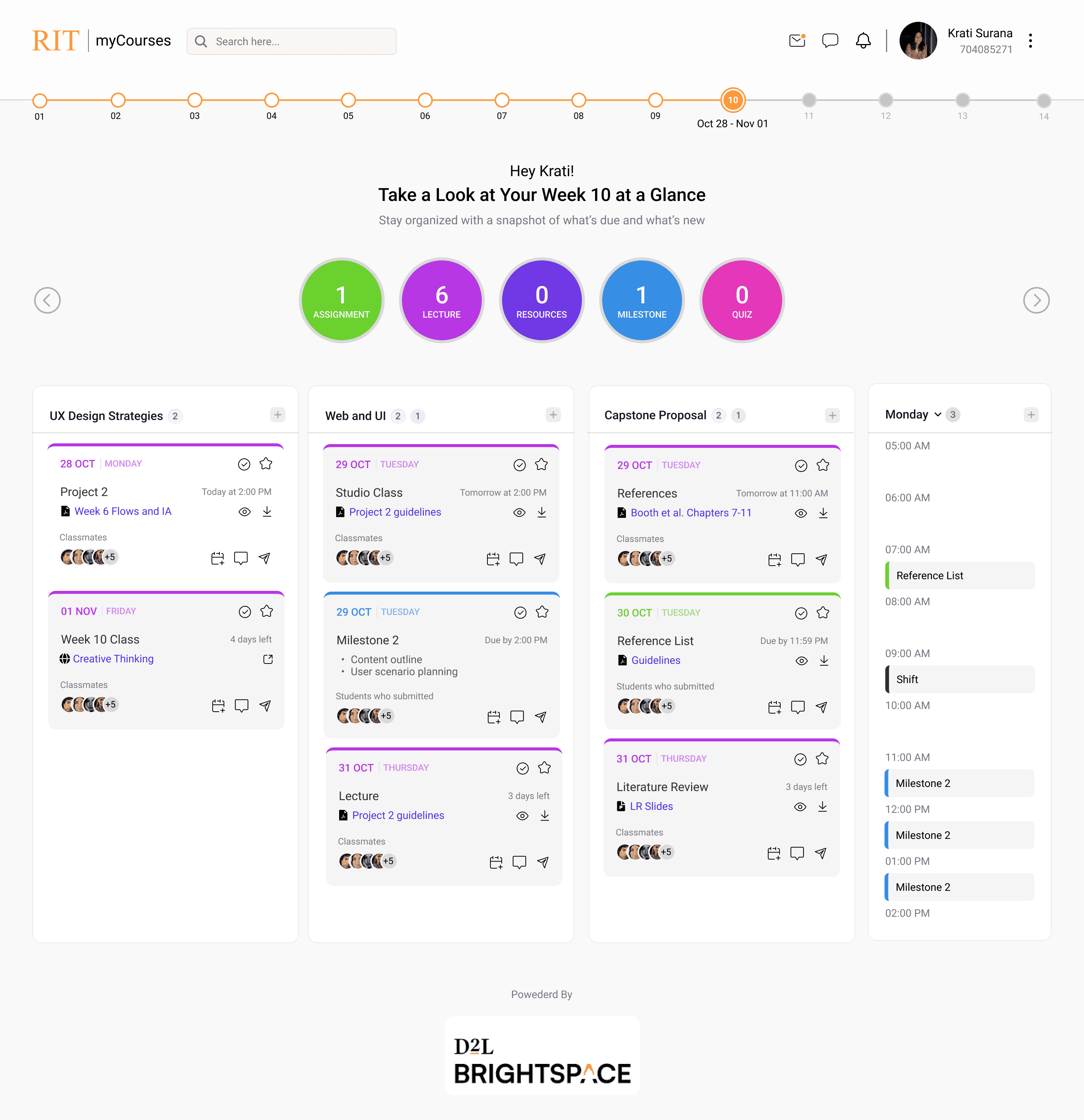
The Assignment Card streamlines the often-frustrating process of submitting assignments, making it quick and easy for students to manage their coursework directly from the home page. By consolidating due dates, submission links, and assignment details in one convenient location, this feature eliminates the need to hunt for information across different sections of the platform, reduces the number of steps required for submission, minimizes the potential for confusion, and helps students stay organized and on track.
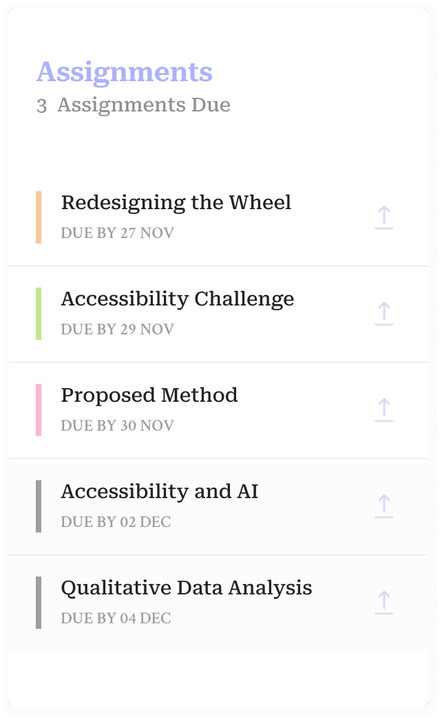
Number of Assignments
A prominent counter displays the total number of assignments due this week, providing a clear overview of the immediate workload.
Deadlines
Each assignment listed includes its due date, allowing students to easily see which tasks require immediate attention and which can be addressed later.
Upcoming Week Assignments
Assignments due in the upcoming week are visually differentiated using a gray color. This subtle cue helps students anticipate future tasks and plan their workload in advance, reducing stress and promoting proactive learning.
1
2
3
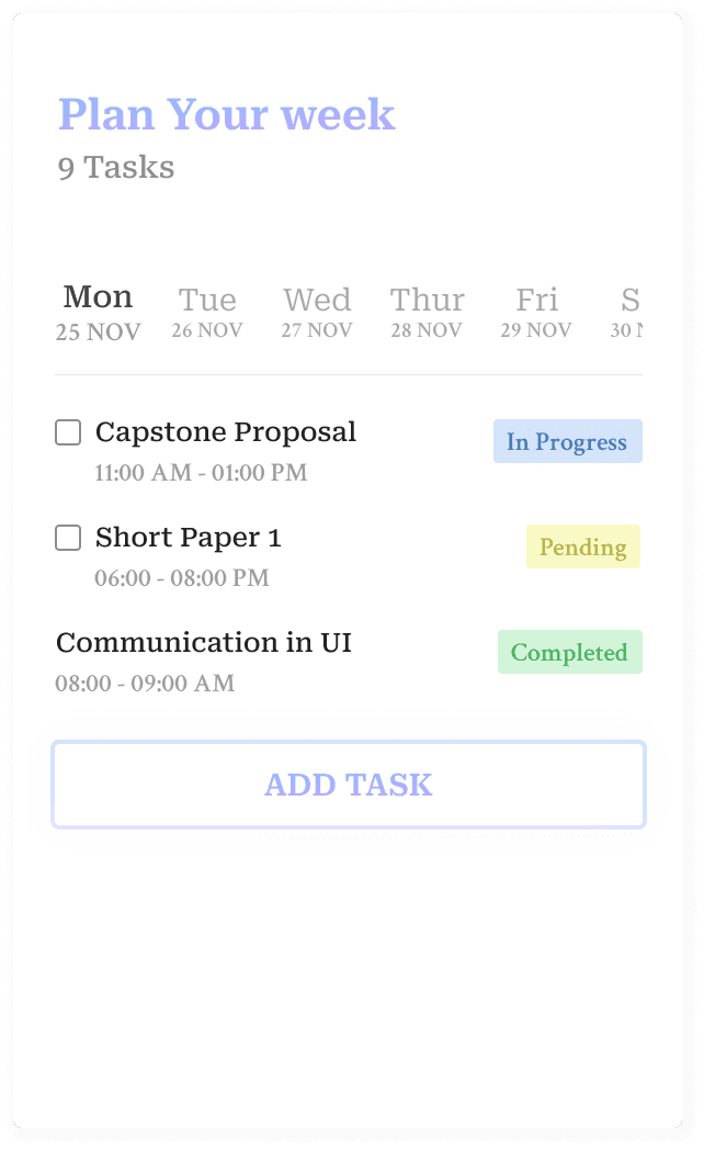
Balancing coursework, extracurricular activities, and personal commitments can be challenging. This task management section addresses this challenge by providing students with a centralized platform to plan and track their weekly tasks. The ability to add tasks, estimate time, and monitor progress through checkmarks and visual indicators empowers students to stay organized, prioritize effectively, and reduce stress
Task Overview
The task overview provides a clear snapshot of the week's workload, allowing students to quickly assess their progress and prioritize tasks effectively.
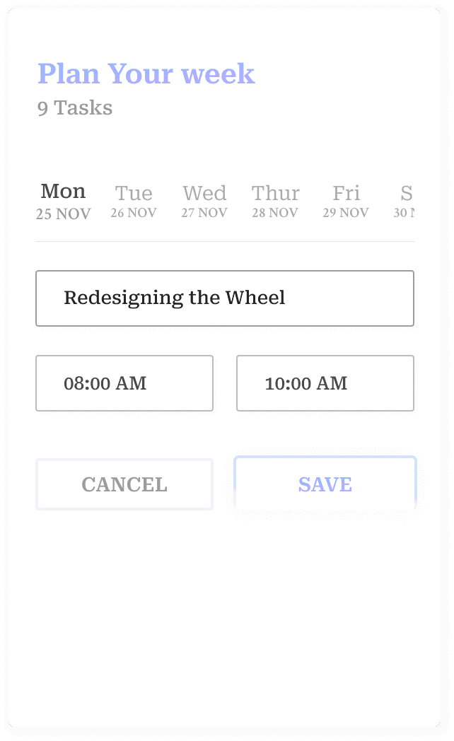
Add Tasks
Adding tasks with flexible start and end times empowers students to create personalized schedules that fit their individual needs and learning styles.
Visual Status Indicators
"Color-coded status indicators make it easy for students to identify which tasks require immediate attention and which are nearing completion, promoting proactive task management.
1
2
2
3
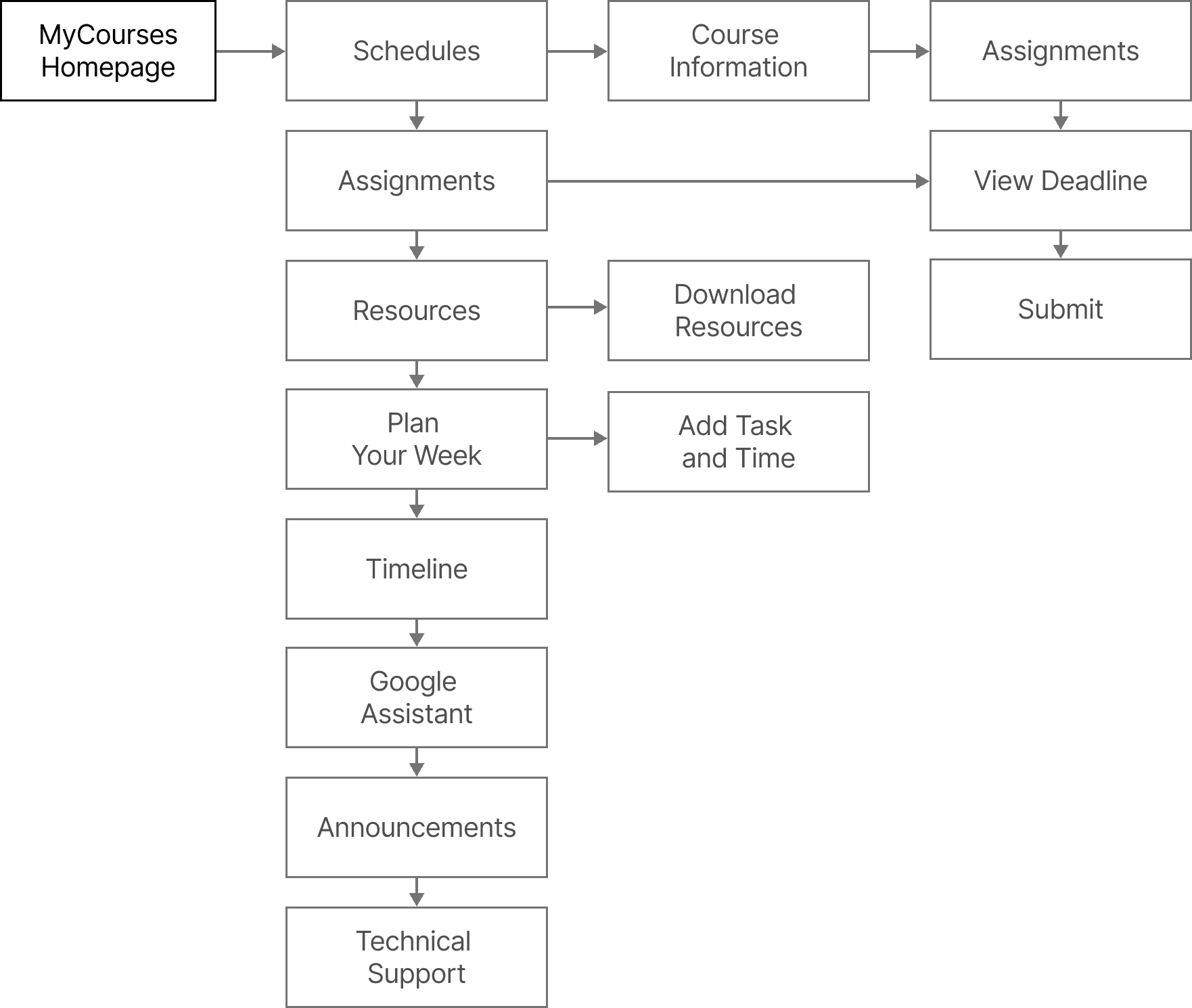
Design Process
Brainstorming to Prototype
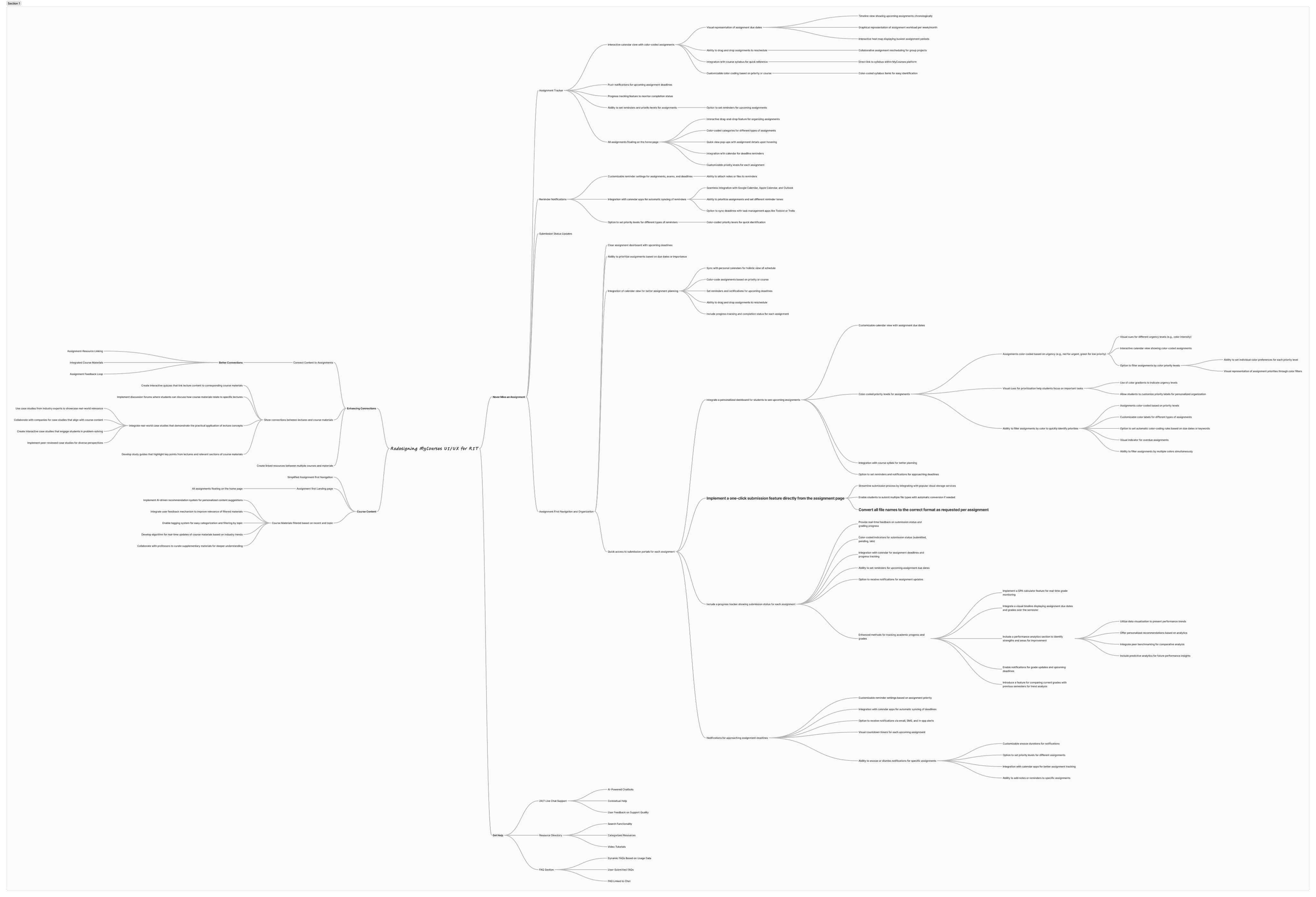
Ideation
Brainstorming sessions focused on generating a wide range of potential solutions. A mind map (see below) was used to visually organize ideas.
Enhanced visual communication
Utilizing color, icons, and visual hierarchy to improve clarity.
Streamlined workflows
Reducing the number of steps required to complete common tasks.
Wireframes
Initial wireframes presented challenges with visual clarity and information organization.
While color was assigned to courses, the color scheme lacked consistency and did not clearly differentiate between courses. The overall card design lacked sufficient visual distinction, potentially leading to confusion and difficulty in quickly identifying specific courses. The grouping of course names and associated tasks was unclear, hindering easy comprehension and navigation.
Final UI Design
A card-based system was implemented for all content, enhancing visual organization and improving information accessibility. Consistent color-coding for courses and subtle visual distinctions between cards improved scannability and user engagement. Careful grouping of information within each card ensured clarity and ease of use.

Information Architecture
Designs
Old vs New Design
Old Design
Key information (deadlines, announcements) is hidden.
Overwhelming information makes it hard to prioritize.
Poor visual hierarchy and lack of clear guidance.
Technical support is difficult to access.
New Design
Prioritizes active courses and key information for easier navigation.
Organizes deadlines for better prioritization.
Uses visual cues to guide students towards urgent tasks.
Provides easier access to contact details and troubleshooting resources.