Overview
Objective
To redesign the Recovery Center of Excellence website to enhance user experience and improve accessibility for individuals in rural communities seeking substance use disorder treatment and support services. This redesign aims to create a trustworthy and welcoming online presence that builds confidence in the Recovery Center of Excellence and encourages individuals to seek help.
Duration
2 Months
My Contributions
As UX Designer, I focused on enhancing user experience by designing intuitive navigation and creating a visually appealing and trustworthy interface. This involved creating wireframes and prototypes, and iteratively refining the design to improve usability and accessibility. Key considerations included building trust through clear and concise information, credible sources (e.g., displaying author names and publication dates for articles), and a professional and welcoming visual aesthetic.
Services
UX design
Information Architecture
Visual Design
Challenges And Solutions
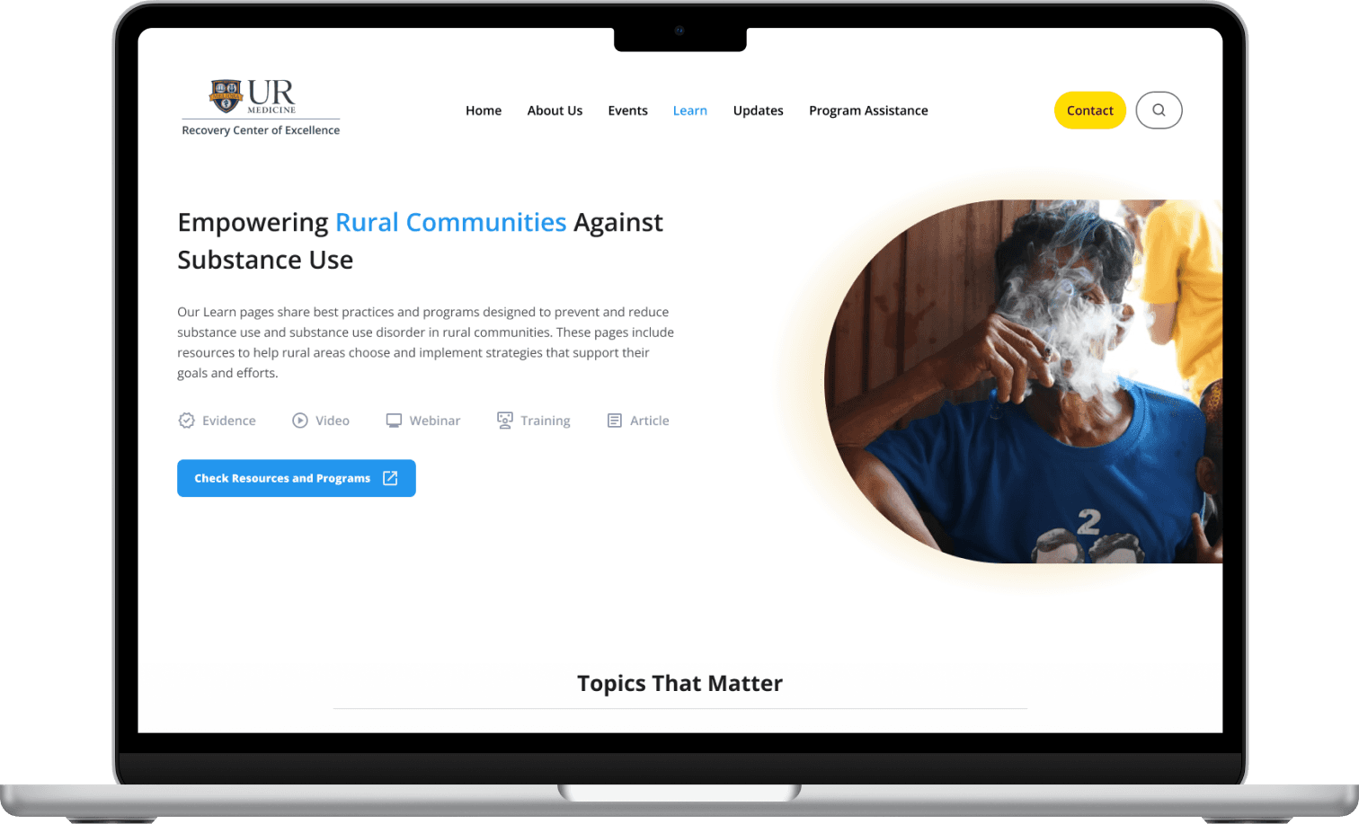
The existing website lacked a clear hero section, leaving users uncertain about its purpose and next steps.
I addressed this by implementing a prominent hero section featuring a clear headline, a concise description of the website's purpose, and a strong call to action (CTA). This provides users with immediate clarity and guides them towards the desired actions. I also included a brief overview of the key resources available on the website, such as articles, tutorials, and webinars, to further inform and engage users.
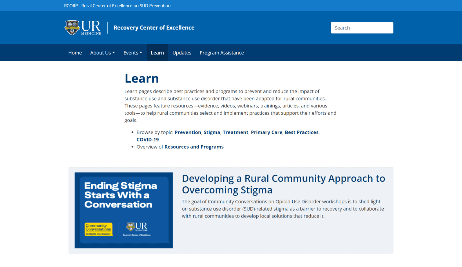
Current Learning Page Hero Section
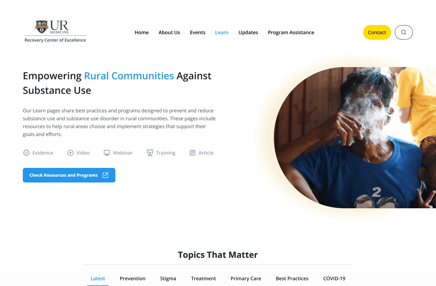
Redesigned Hero Section
Improving Website Navigation and User Findability
The existing website navigation presented challenges, with users struggling to locate desired information. The navigation for different categories was poorly defined, with a lack of clear visual hierarchy and reliance on text-based cues, making it difficult for users to quickly and easily find what they were looking for.
To address these challenges, I redesigned the navigation system to prioritize clarity and user-friendliness. Key improvements included: utilizing font sizes, spacing, and visual weight to prioritize key navigation elements and guide user attention and introducing a prominent heading, "Topics That Matter," to draw user attention to the navigation menu. I also added a new category, "Latest," to highlight recently added content and encourage exploration of fresh material.
Existing Website Navigation
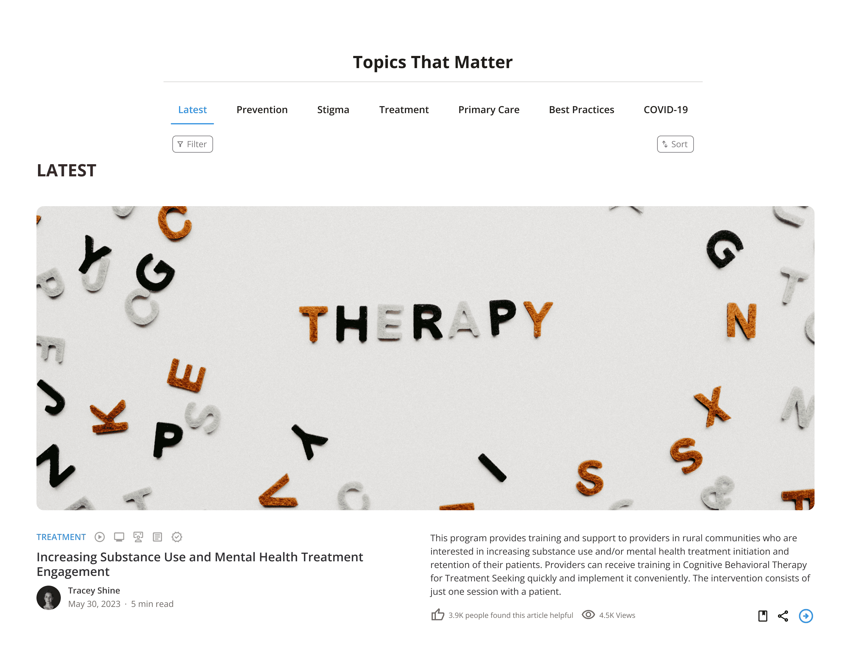
Redesigned Navigation
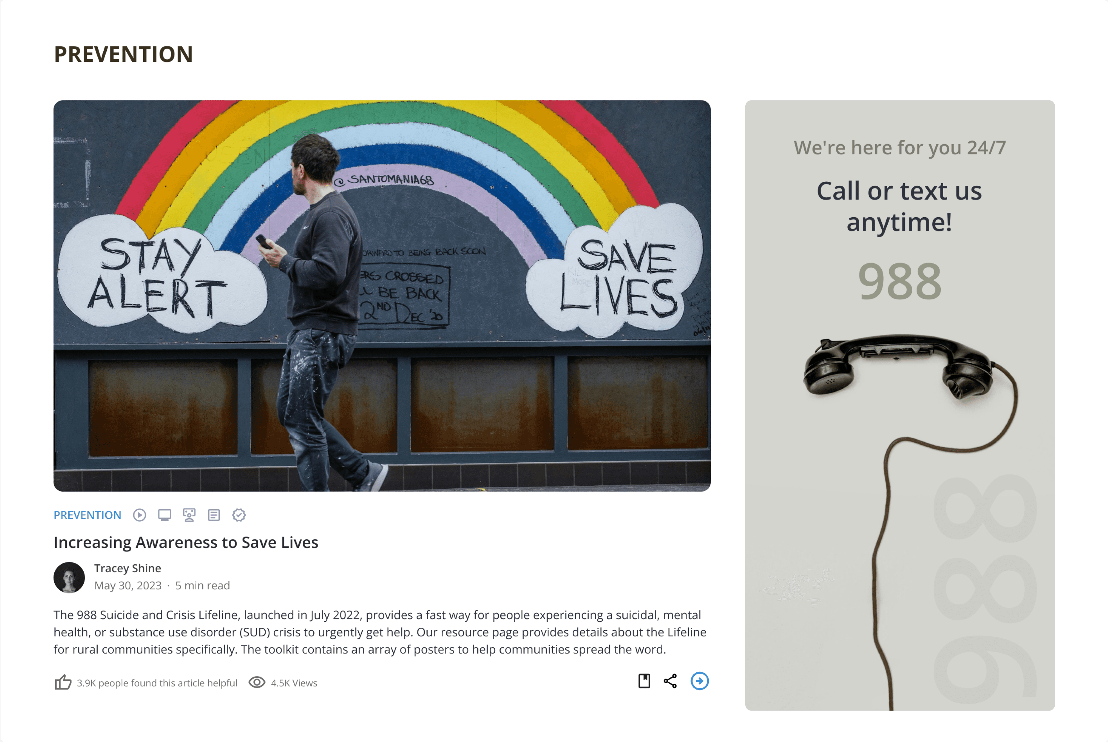
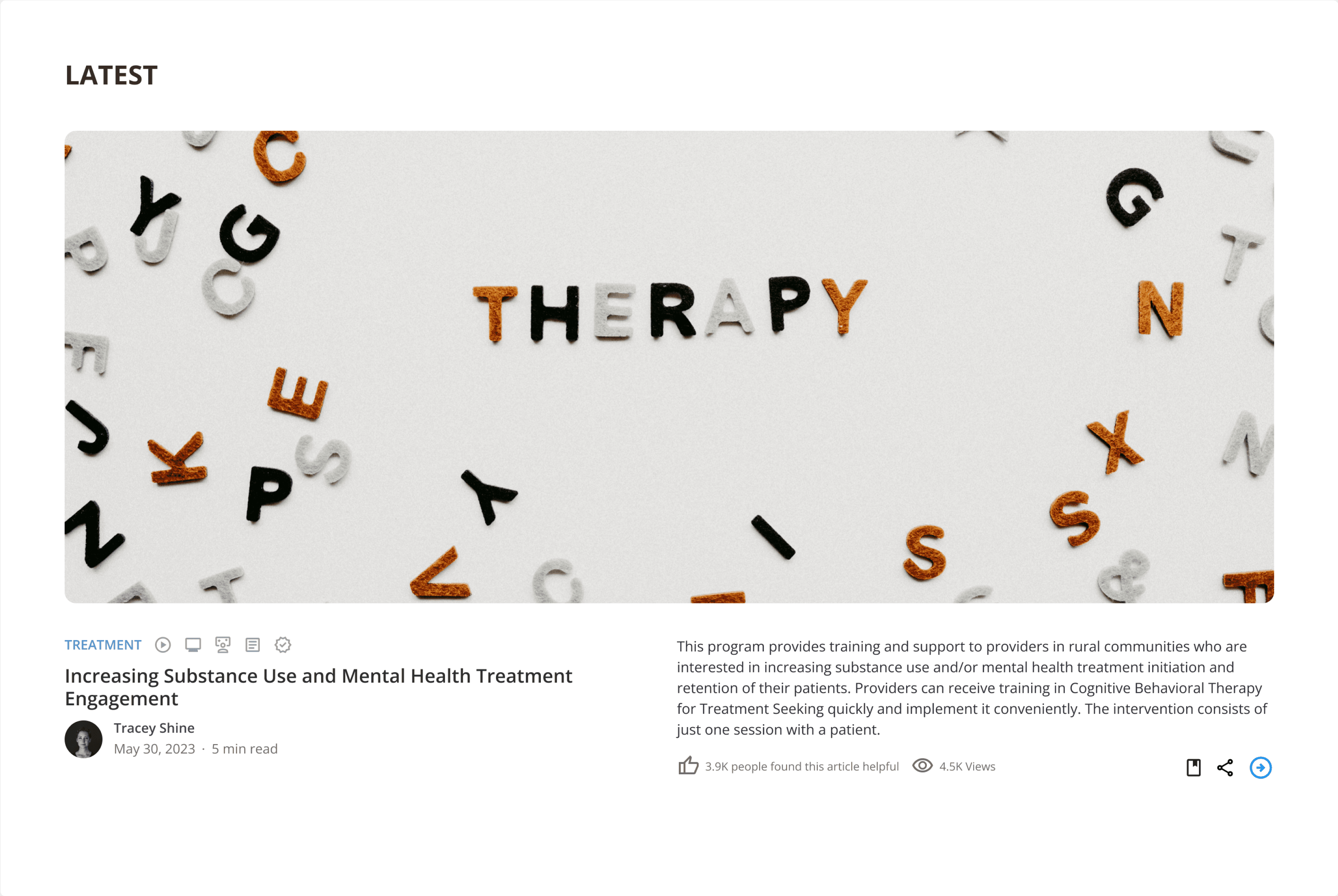
Enhancing Article Discoverability and User Engagement
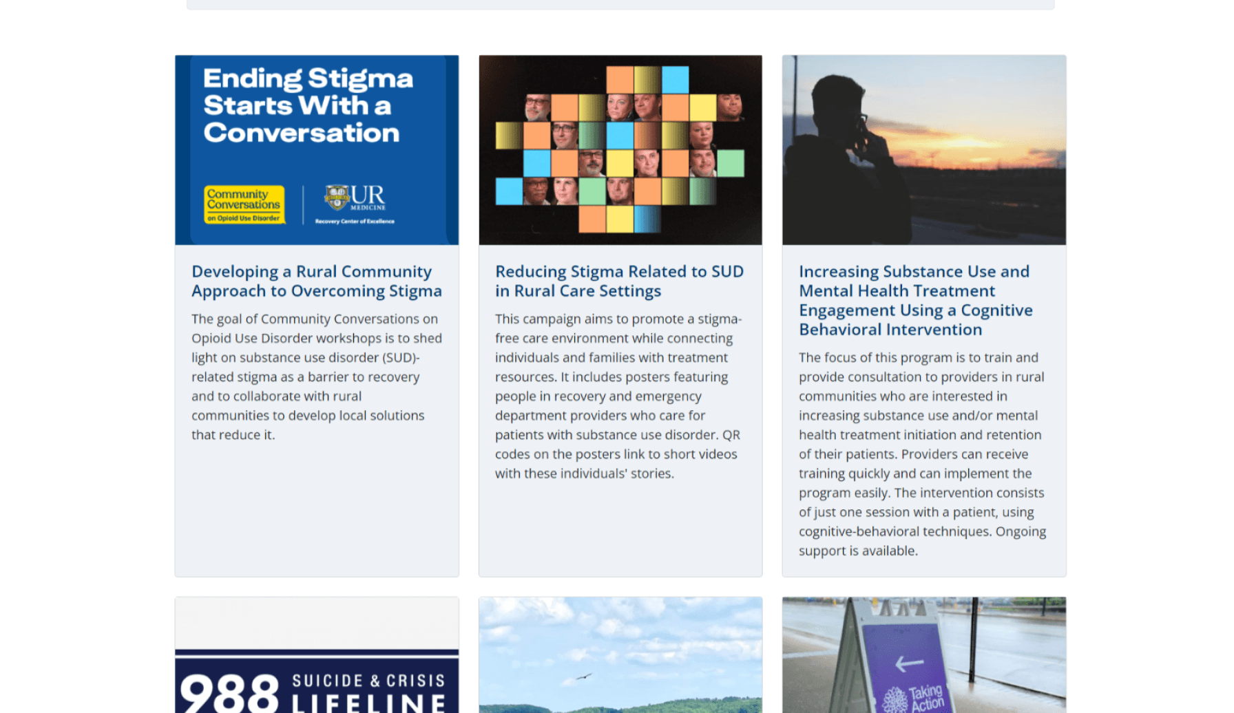
The existing website hindered article discovery and limited user engagement. Articles lacked visual cues and key information like author names and publication dates, making it difficult for users to distinguish between them and assess their credibility. This lack of transparency could erode user trust.
To address these issues, I implemented several enhancements. These included adding visual cues such as tags and category labels, incorporating author names, publication dates, view counts, and feedback options, and integrating bookmarking and sharing functionalities. These improvements aimed to enhance user engagement, build trust, and provide a more enriching user experience.
Limited Article Differentiation on the Existing Website
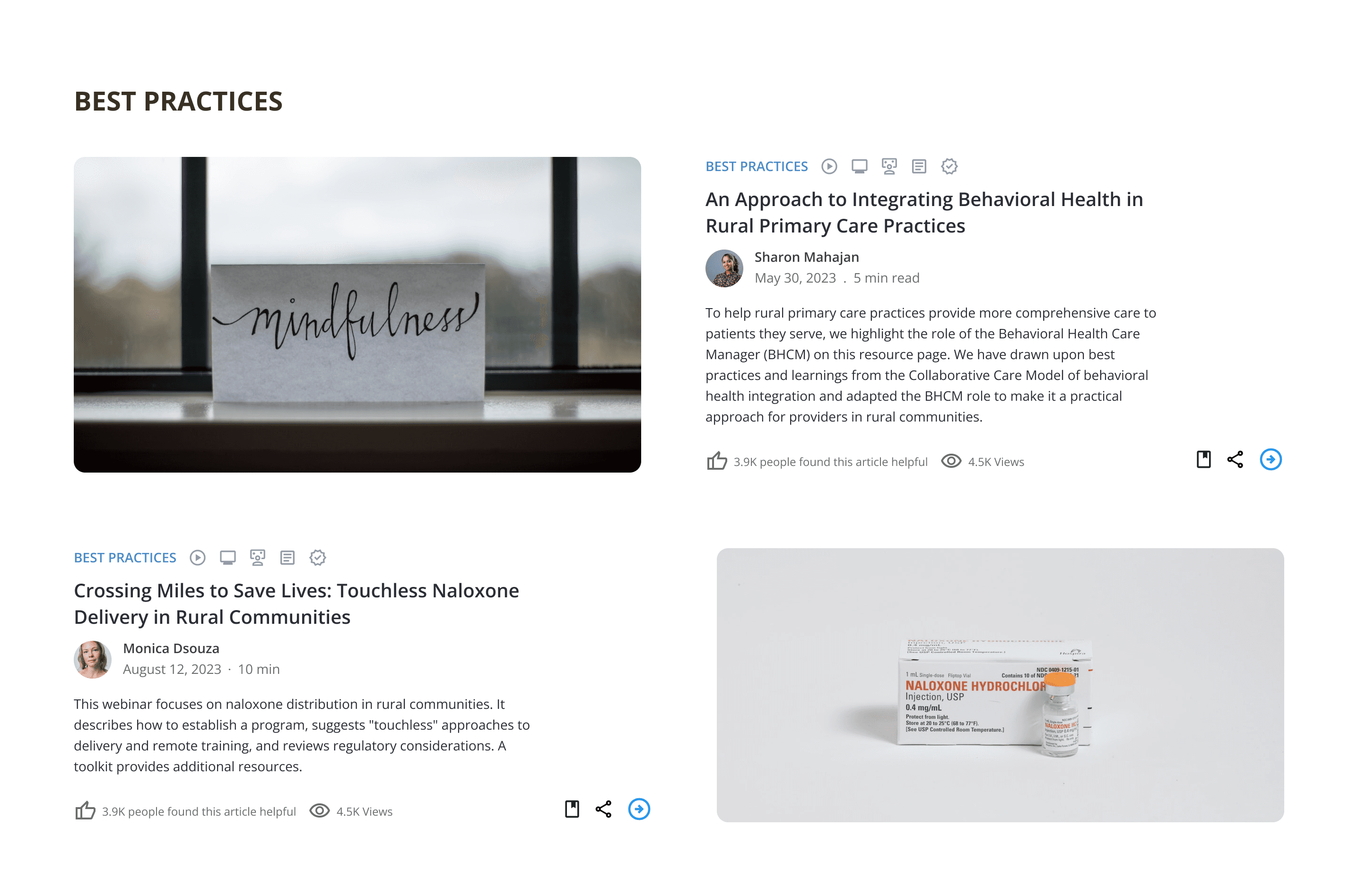
Enhanced Article Discovery and User Interaction
design SYSTEM
Typography
Ag
Open Sans
Regular
H1
H2
H3
Body
Tag
Subtext
Open Sans SemiBold
Open Sans Bold
Open Sans SemiBold
Open Sans Regular
Open Sans SemiBold
Open Sans Regular
32
28
20
15
14
12
Color Palette
Primary
Neutrals
UI Components
Button
Button
Button
Final Design
UI Design